9 Plotting Fisheries Data
This document will now walk you through how to make make some basic fisheries plots using the data frames you created in the previous analysis section and the ggplot plotting function. When using ggplot, first start with your data frame and initialize the ggplot by specifying the plot’s aesthetics (variables) using aes(). Then use the + operation to add at least one geometry (type of plot, such as a scatter plot) and any additional features to the plot. To learn more about ggplot, the Data Visualization with ggplot2 Cheat Sheet is a very helpful resource, as is this ggplot cookbook.
9.1 Plotting Landings
Let’s plot a time series of annual landings data. We start with the annual landings data we made in the previous step, and then feed this into a ggplot.
# Start with the annual_landings data frame you created in the last step
annual_landings %>%
  # Initialize a ggplot of annual landings versus year
  ggplot(aes(x=Year,y=Annual_Landings_kg)) +
  # Tell ggplot that the plot type should be a scatter plot
  geom_point() +
  # Also add a line connecting the points
  geom_line() +
  # Change the y-axis title
  ylab("Annual Landings [kg/year]") +
  # Add figure title
ggtitle("Annual landings of Caesio cuning") 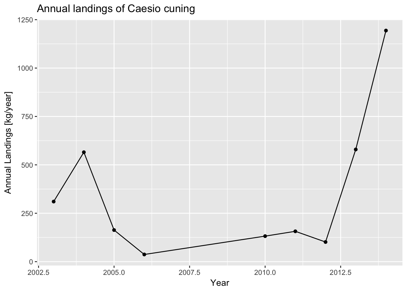
In this example, we are using aes(x=Year, y=Annual_Landings_kg) to specify that the we want to plot years on the x-axis and annual landings on the y-axis. We then want to visualize these variables with both a scatter plot (geom_point()) and a line plot (geom_line()) geometry.
It appears landings were going down between 2004 and 2011, but have been increasing since then. Again, you may be interested in looking across different gear types. To plot, we use ggplot’s faceting functionality, which tells ggplot to divide up the data by a certain variable, Gear in this case, and make multiple similar plots. You can use the facet_wrap() function to accomplish this.
# Start with the landings data frame
annual_gear_landings %>%
  # First, group the data by year
  group_by(Year,Gear) %>%
  # Initialize a ggplot of annual landings versus year
  ggplot(aes(x=Year,y=Annual_Landings_kg)) +
  # Tell ggplot that the plot type should be a scatter plot
  geom_point() +
  # Also add a line connecting the points
  geom_line() +
  # Change the y-axis title
  ylab("Normalized annual Landings [kg/year]") +
  # Add figure title
  ggtitle("Normalized annual landings of Caesio cuning") +
  # This tells the figure to plot by all different gear types
facet_wrap(~Gear) 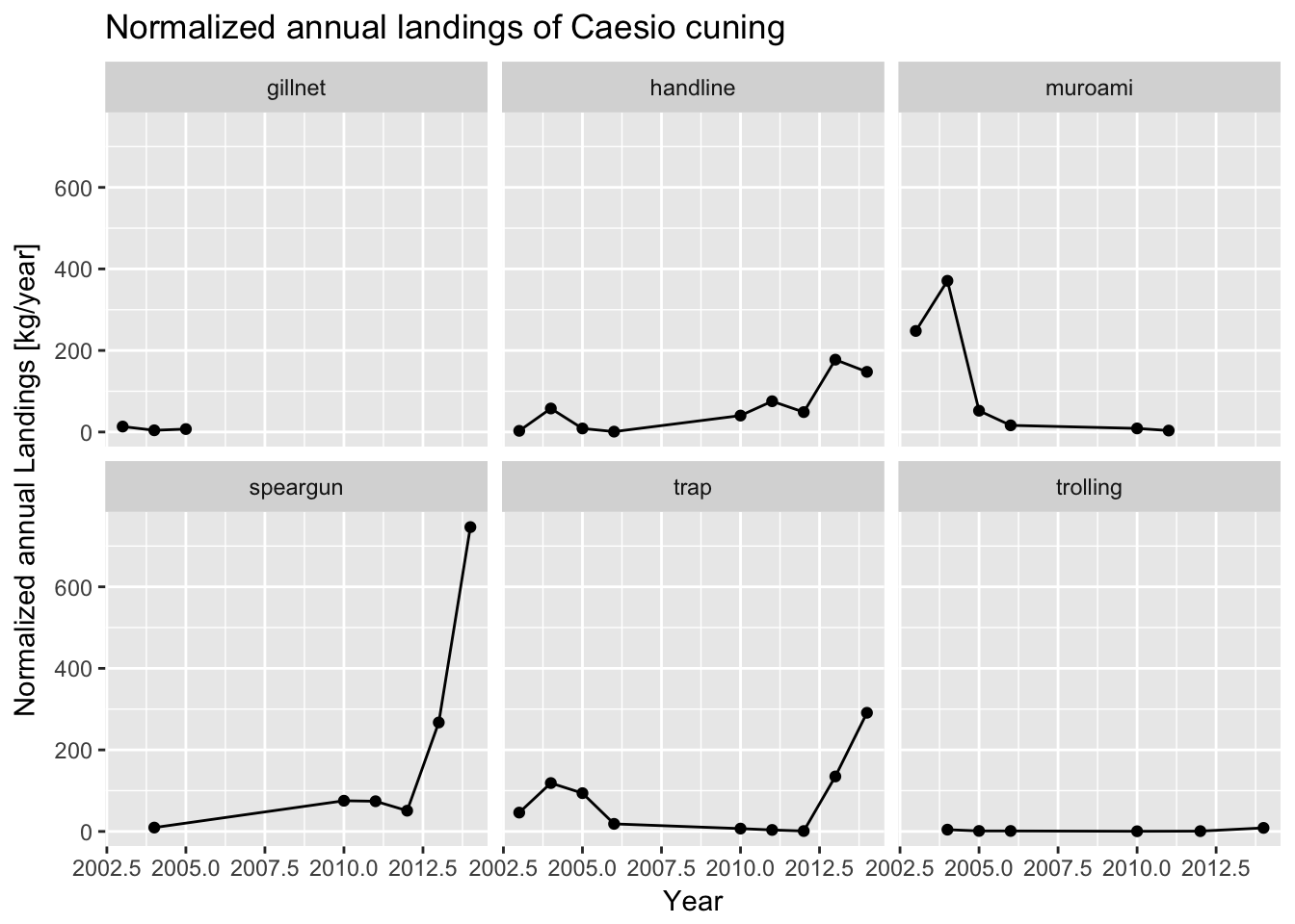
It now becomes clear that the recent increase in catch seems to be concentrated in speargun and trap fishing. Meanwhile, catch from muroami, a very destructive type of gear where nets are driven into the reef, has dropped to 0 since a ban of that gear in 2012 - a good sign that management regulation is working.
9.2 Plotting CPUE
You may also be interested in plotting median catch-per-unit-effort (CPUE). You take your CPUE data frame made in the last step and feed it into ggplot.
# Start with the CPUE data frame
cpue_data %>%
  # Initialize a ggplot of median CPUE versus year
  ggplot(aes(x=Year,y=Median_CPUE_kg_hour)) +
  # Tell ggplot that the plot type should be a scatter plot
  geom_point() +
  # Also add a line connecting the points
  geom_line() +
  # Change the y-axis title
  ylab("Median CPUE [kg/hour]") +
  # Add figure title
ggtitle("Median CPUE for Caesio cuning") 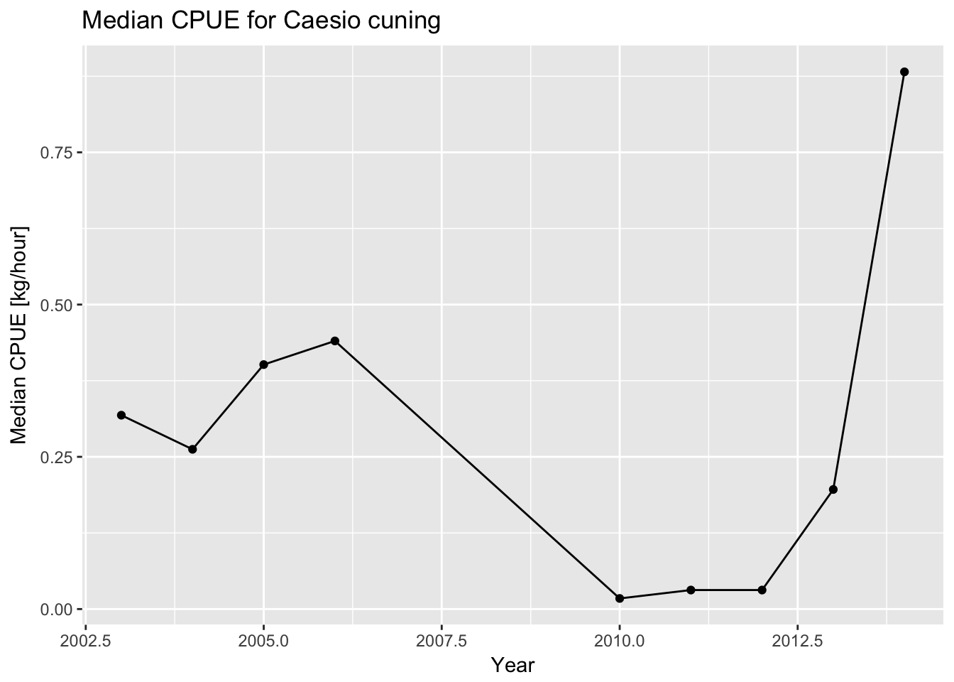
CPUE appears to have increased significantly during the last years. This may be due to increasing abundance in the water, which would be a good thing, but may also be indicative of increased gear efficiency coinciding with the transition to traps and spearguns, which may be concerning.
9.3 Plotting Length Frequency
Finally, let’s first look at the length data from the catch, which gives an indication of the size structure and health of the population. Let’s look at the length data for 2014, which is the most recent year of data available. We first filter the data to be only from 2014 using the filter() function. We then create a histogram of the length data, which shows how many individuals of each size class were measured in the catch. On the histogram, we’ll also add a vertical line to show the length at which fish mature to get a sense of how sustainable the catch is - the catch should be composed mostly of mature fish. This information comes from the life history parameter data input file.
# Start with the landings data frame
landings_data %>%
  # Filter data to only look at length measurements from 2014
  filter(Year == 2014) %>%
  # Initialize ggplot of data using the length column
  ggplot(aes(Length_cm)) +
  # Tell ggplot that the plot type should be a histogram
  geom_histogram() +
  # Change x-axis label
  xlab("Length [cm]") +
  # Add figure title
  ggtitle("Length histogram of Caesio cuning in the catch\nLength at 95% maturity shown as a red line.") +
  # Add a red vertical line for m95, the length at which 95% of fish are mature. Any fish below this length may be immature. Use the m95 value defined in the previous section
geom_vline(aes(xintercept=m95),color="red") 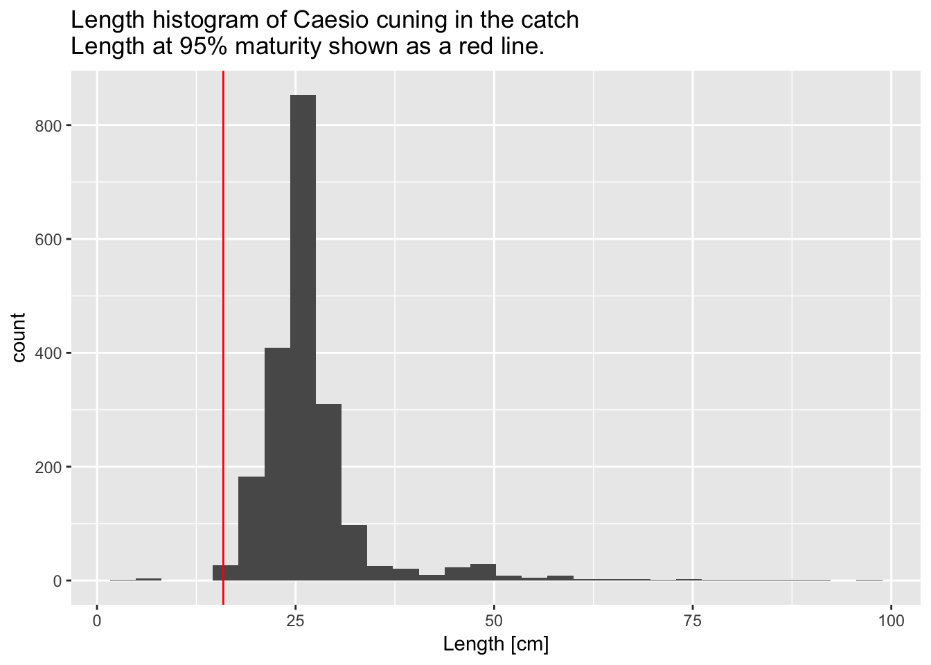
You might also be interested in seeing how the size composition varies by gear type. You can recreate the figure above, but separate the histograms out by gear type using ggplot’s “facet” function.
# Start with the landings data frame
landings_data %>%
  # Filter data to only look at length measurements from 2014
  filter(Year == 2014) %>%
  # Initialize ggplot of data using the length column
  ggplot(aes(Length_cm)) +
  # Tell ggplot that the plot type should be a histogram
  geom_histogram() +
  # Change x-axis label
  xlab("Length [cm]") +
  # Add figure title
  ggtitle("Length histogram of Caesio cuning in the catch by gear type\nLength at 95% maturity shown as a red line.") +
  # Add a red line for m95, the length at which 95% of fish are mature. Any fish below this length may be immature. Use the life_history_parameter data frame to get this value.
  geom_vline(aes(xintercept=m95),color="red") +
  # This tells the figure to plot by all different gear types, known as facetting
facet_wrap(~Gear) 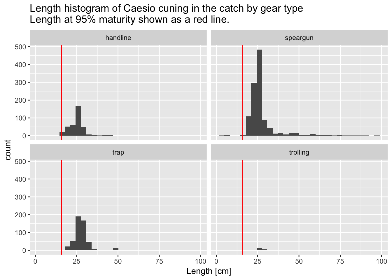
It appears as if the size structure is about the same from each gear, although by far the most amount of fish are caught using speargun. Very few fish are caught using trolling.
These plots indicate a generally increasing catch, CPUE, and a healthy size structure. Our results demonstrate that the population is likely doing fairly well, and may be recovering since the 2012 ban of muroami fishing gear.